An originator profile that works as a landing page
Your identifier, licensed states, focus programs, estimator and apply link on one page a referral can act on immediately.
Who it's for
Originators
Specialists
Features
The site
Services
Design and build
Grow and scale
Resources
Loan officer website design is the work of turning a name a borrower was given into a page that person can act on. That means your identifier and licensed states where they can be seen, the programs you actually originate written in plain language, an estimator that produces an illustrative figure on your own domain, and one obvious next step into the application your lender already hosts. Everything else on the page is in service of those four things.
What it costs
Most people who reach a loan officer site were sent there. A listing agent texted the link, a past client forwarded it, a builder handed over a card. That visitor arrives knowing your name and nothing else, usually on a phone, usually while doing something else. So the first screen has to answer who you are, what you originate, where you are licensed and what happens next, without a scroll. We design that screen first and let the rest of the site follow from it. The homepage carousel, the stock family on the porch and the three-column value proposition all come out, because none of them answer the question the visitor actually arrived with.
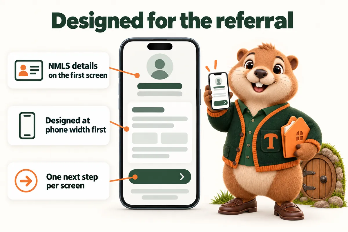
A loan officer is a person, and the design should look like one person is behind it. We use a single accent color, one heading typeface with a real reading face underneath it, generous line length and photography of you rather than of a couple holding keys. Corporate template sites tend to look interchangeable because they are: the same hero, the same icon set, the same four badges. We build the visual system around your brand, or around a restrained one we make with you if the lender leaves that open. It is quieter than most mortgage sites and it converts better, because a borrower deciding who to trust with the largest debt of their life is reading, not being sold to.
Almost every loan officer site sends its most motivated visitors to a third-party calculator, and that site captures the lead. We design the estimator into your page instead. The borrower enters a purchase price, a down payment and a term, sees an illustrative monthly figure, and reads a clear line telling them it is an estimate and not a quote, an offer or a pre-approval. The design carries that disclaimer at the same weight as the number, which is both the honest choice and the compliant one. When they ask for a real conversation, the details land in your CRM or LOS with the program and the figures they were looking at attached.
A design is only as good as its worst-maintained page. Licensed states change, a program is retired, a disclosure needs new wording, a headshot is replaced. On most sites those changes queue behind an agency ticket for a quarter and the design quietly decays. Here they are revisions: 5 a month included, any size, each completed within 2 to 5 working days, all raised in your client portal. Because the disclosure block, the identifiers and the licensing lines are defined in one place, a wording change is made once and appears identically everywhere. That is what keeps the design looking designed a year after launch.
Your identifier, licensed states, focus programs, estimator and apply link on one page a referral can act on immediately.
Conventional, FHA, VA, jumbo, renovation, whatever you place, each written for a borrower rather than for an underwriter.
An illustrative figure, labeled as an estimate, with the visitor captured as a lead instead of by a third-party calculator.
One accent color, one type pairing, one corner radius, applied consistently across every page and every future addition.
Equal housing wording, identifiers and licensing lines defined in one place so a change reaches every page at the same moment.
Forms, callbacks and estimates delivered into your CRM or LOS by API, Zapier or Make, tagged with the page they came from.
“If you only look at the design you miss the best bit, which is the inquiry form. It collects purchase or refinance goal, property state and callback time up front, so the back-and-forth we used to do by reply has largely gone. It has quietly removed the slowest step in our intake.”
What they got: Inquiry form and response workflow for home loan consultations
“Most of our visitors are on phones, so that is where I reviewed the new home loan consultations pages. Everything a visitor needs is up top, and the inquiry button stands out properly. It is far more practical than the old page when we share it with a caller.”
What they got: Mobile navigation and page layout for home loan consultations
“Before this, sending our home loan consultations form felt like posting a letter into the dark. Submitters now see exactly what we will do with their request and when to expect us. It is a small corner of the site that makes the whole process feel finished.”
What they got: Submission acknowledgment and follow-up for home loan consultations
Client projects where this service did the heavy lifting, start to finish.
Usually yes, and that is normal. Most lenders and brokerages have an advertising review process for an originator site. We build to the wording your compliance team gives us and hand you a review link before anything is public. Approval decisions and the advertising rules themselves stay with you and your compliance team; we place what they approve.
Yes. Bring whatever you already have and we design around it. If the headshot is low resolution we will tell you plainly, because a soft photograph at the top of the first screen undoes a lot of otherwise careful design. Replacing it later is a revision like any other.
The design does. The site is yours and the domain is registered in your name, so the pages, the copy and the structure travel with you. Identifiers, disclosures, the apply link and any lender branding are changed as revisions when you move, usually inside a single week.
Only a rate you choose to publish, and only as an input to an illustrative figure. We do not source, quote or suggest a rate, and the page states in plain words that the result is an estimate rather than a quote, an offer or a pre-approval. Whether to publish a figure at all is your decision with your compliance team.
7 days from the onboarding call on the Solo Originator plan. You see the site before it goes live and ask for changes. The one-time build fee is invoiced only after it is live and you have approved it.
Yes, and it should be a real photograph of you rather than a stock image of someone at a desk. A borrower arriving from a referral is checking that the person they were told about is the person they found. A current, well-lit headshot at a usable resolution does more for that in one second than three paragraphs of copy. If the only file you have is a low-resolution crop from a group photo, we will tell you plainly, because a soft image at the top of the page undoes a lot of careful design.
Three things, in order. A page for each program you originate rather than one list of nine bullets, because a borrower reading about the program they were told about needs somewhere to read it. Your identifier and licensed states where they can actually be seen rather than in six point type at the bottom. And one next step repeated down the page rather than four competing ones, because a page offering a call, a chat, an application and a newsletter at the same weight gets none of them.
Yes, and this is normal. Most originators work inside a lender or brokerage brand with rules about logo use, colors, disclosure placement and what may be claimed. Send us the guidelines on the onboarding call and we design inside them. Where the guidelines leave something open, we make a restrained choice and show it to you before launch rather than after.
A live walk-through of the site you would get, in about 30 minutes. Plans from $137 a month, the $797 build fee invoiced only after launch, domain and hosting included.
Book a demoOr email and a person replies within one working day.
MortgageWebStudio uses the cookies below. Necessary cookies keep the site working and cannot be turned off.
Saved on this device only. Press Esc to close.